Burger King
Not a blank canvas
One of the most recognizable brands on the planet — every color, every font, every flame-grilled detail already defined. The challenge isn't creating a visual identity. It's using one brilliantly.
Burger King Bolivia came to Giro54 with an app that worked but didn't convert. Too many steps, unclear navigation, a design that wasn't connecting. The experience was there. The ease of buying wasn't.
Credits
Client: Bolivian Food S.A.
Director of Design: Peter Verastegui
UX Designer: Gabriela Terrazas
The Challenge
The brief was simple: design an app and web platform that has a better UX experience. The goal was to increase conversion and make the app a more effective tool for customers to interact with
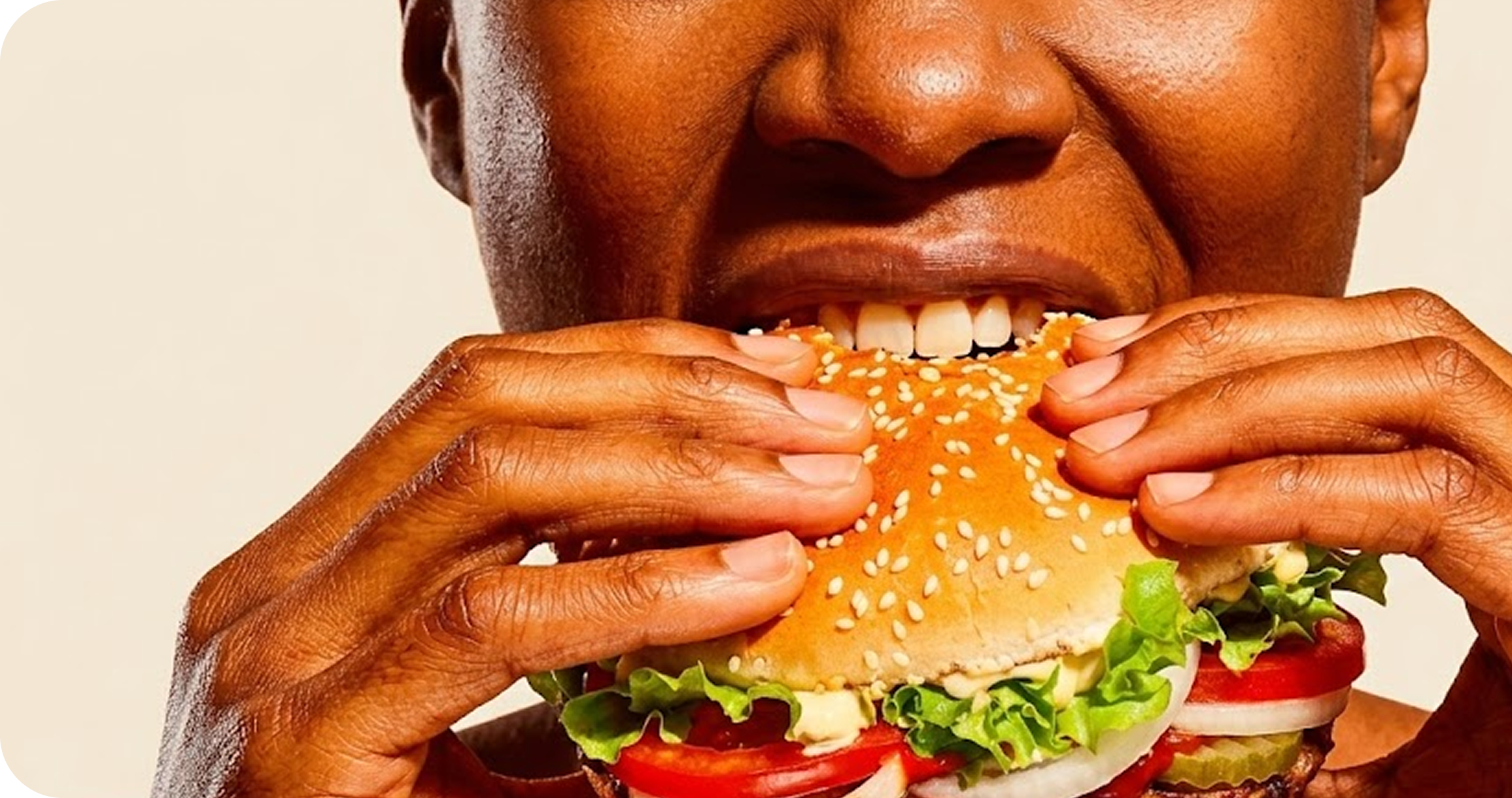
The design challenge: make it feel unmistakably BK — bold, fun, irreverent — without ever getting in the way of someone just trying to order a Whopper.
Translating the brand into a design system
The project needed to feel unmistakably Burger King while still behaving like a modern product. A great challenge, so we used animations and illustrations, from the styleguide, to enhance the irreverent personality of the brand.


User Interface
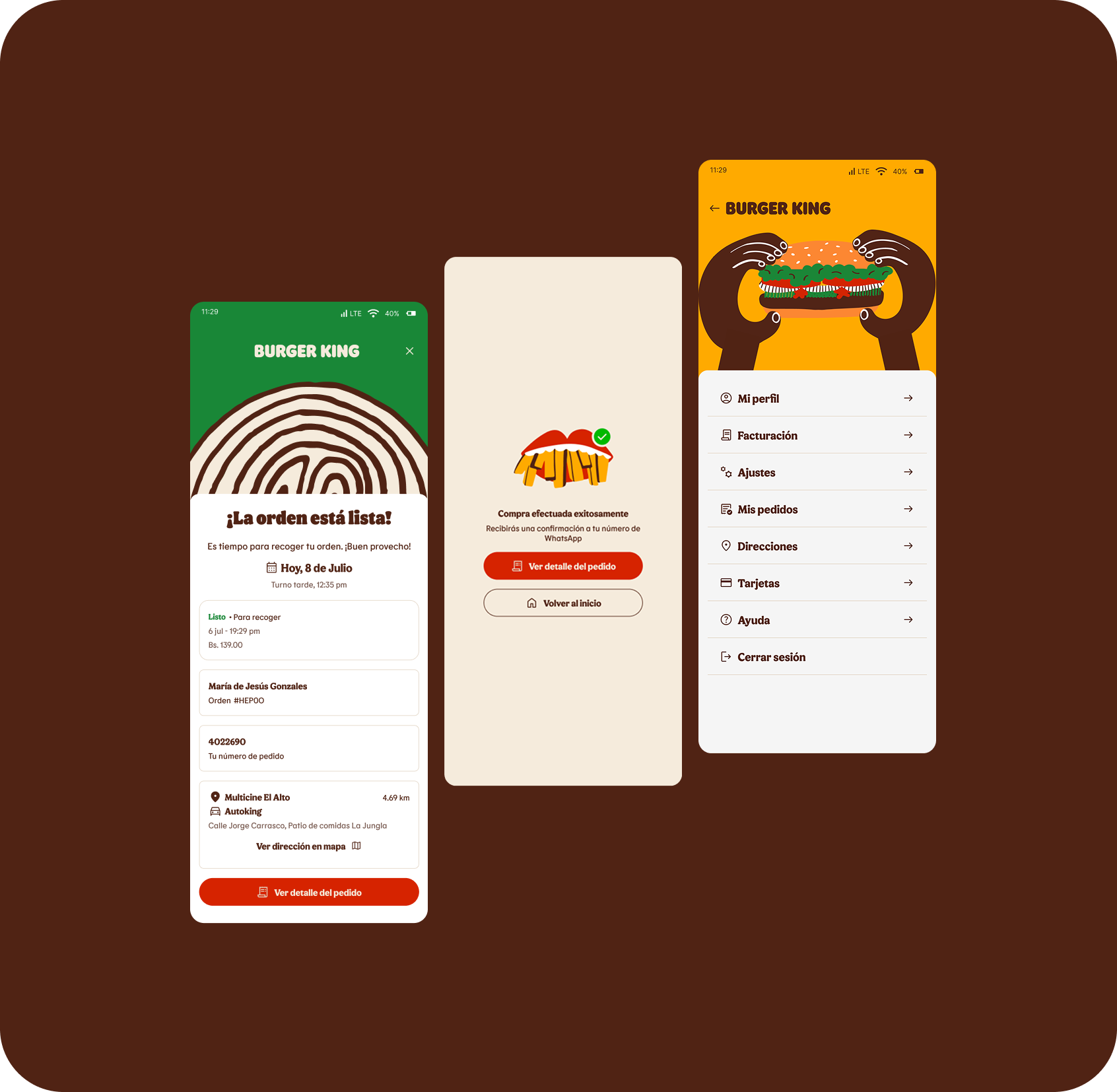
Ordering flow and on-screen personality
The core UX work was simplifying the path to purchase. Clearer navigation, fewer decision points, and faster checkout made the app feel less like a task and more like an invitation.
We also made the illustrations work harder. They do not just decorate the interface; they guide the user through the menu, support moments of delight, and reinforce the tone of the brand.
What We Learned
Working with a brand this established teaches you something: restraint is a skill. Everything you need is already there — your job is to know what to add, what to leave alone, and how to make it all work together.
That balance is what drove every decision on this project. The result is a product that doesn't just look like a brand. It works like one.